His Cocrea account: https://cocrea.world/@Kaplin86
PanelGUI usage
PanelGUI is a versatile extension to create dynamic UI rather than having to do it manually, saving a lot of time and effort. There are many options with styling and inputs with this extension making it far better than having to manually make some inputs, for example: Color and dropdown options.
PanelGUI docs
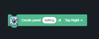
In PanelGUI each GUI, more commonly referred to as a panel, has a name and is constructed with this block.
Panel Controls
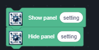
You can hide and show a panel using
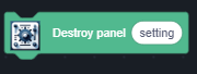
If you are certain that a specific panel wont load up for a good while, you can destroy the panel to save resources.
Input Bindings
Inside of PanelGUI, there are various inputs you can use for your UI.
Each input block has a name value, a value for the panel, then a default value, alongside any other parameters.
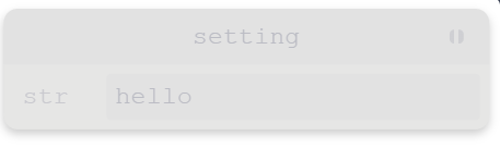
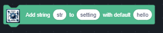
String
PanelGUI has a built in string input, however this can also be used for several other types of inputs.
NOTE: Theres no limit inside of a string parameter! See “Editing inputs”!
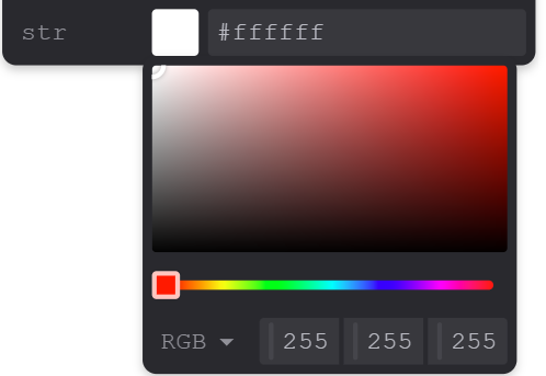
Color
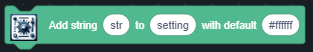
You can use a “Add string” block to also add colors by inputting a hex code as the default! The color picker can be opened by clicking the colored box beside the text
Another possible way to add color is by having “rgb(0, 255, 214)” or something of the likes as a default value
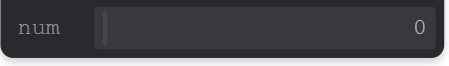
Number
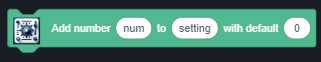
By using the “Add number” block, you can add a number input to your panel.
Note: This input has no limit. Unlike the string extension, there is a limited version of the block already in the extension!
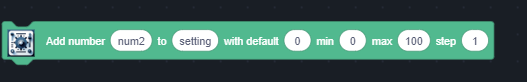
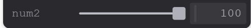
Slider Number
Alike to the variable slider, the “add number with min max” block will add a slider input to your UI.
The min refers to the lowest number it can go, and the max is the highest.
The step is like a sort of “snapping”. The slider’s value only increases a step at a time.
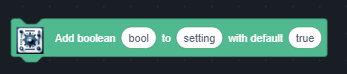
Bool
A bool is basically a checkbox, its either checked or unchecked. You can set the default to true or false.
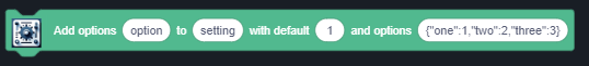
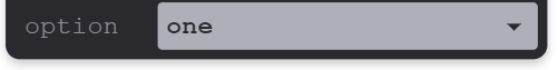
Dropdown
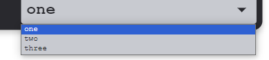
Options, more commonly known as dropdown, is one of the more powerful inputs inside of panel GUI.
Inside of the “Options” variable, you have a dictionary of Names and IDs. In the following image, the name “one” is connected to the id 1, “two” is connected to 2, and so on.
The default is the ID of the selected item.
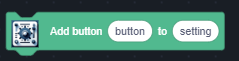
Buttons
Last but not least, buttons!
They are the simplest of the inputs due to not having any sort of default.
Reading data
Getting Button Presses
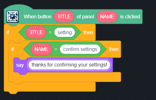
To get a button press from one of your panels, You can use the corresponding “When button of panel is clicked”.
This hat block will run when ANY button from ANY panel gets ran.
It gives both the name of the panel, and also the name of the button, so its best practice to have a if statement for the code.
Listening for changes
You can use this hat block for when a value changes!
The values it gives are the property of the input, which is its type (Like “str” or “bool”), its Name, and its current value.
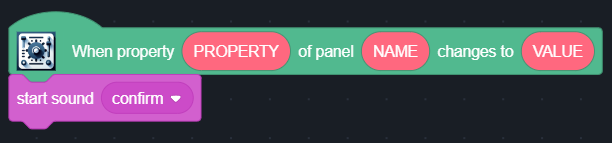
However! There is a catch to this! It only runs whenever a string or listened-to property changes!
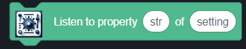
To listen to a input, you use the respective listen to property block.
You insert the name of the input, alongside the name of the panel.
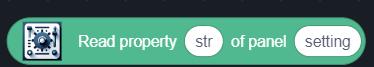
Read directly
You can directly read from a value on command using the “Read property” block.
It takes in the name of input and the panel name, and returns the given data.
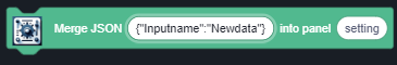
Changing Data
Maybe you want to change the data of a input after your panel has finished being made. You might have tried re-using the “Add” blocks to your panel, just to see that it moves the input to the very end!
Luckily for you, you can use the “Merge JSON” block to edit your panel directly.
You can change the data of a input with ease!
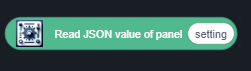
This block might be a bit confusing, but you can use the “Read JSON” block to see similar to data to the input of the block.
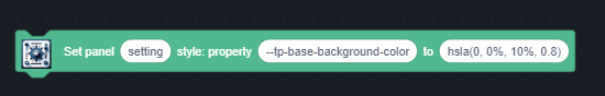
Style
This is what makes the extension so powerful, sadly this is the most confusing part of the extension.
Using the respective block, you can turn various properties to specific colors! How neat :)
The best way to do this is make your panel design using the theming-creator on the Tweakpane docs: https://tweakpane.github.io/docs/theming/#builder
After making the wanted design using the given builder, you can scroll down to see the individual style properties.
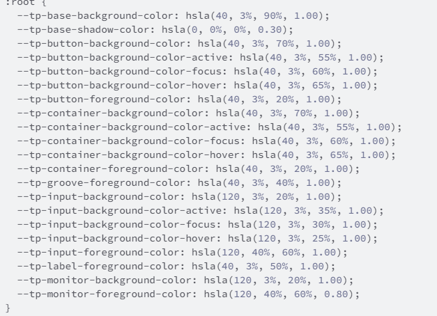
Copy all the items you want, its a lot and might be tedious!
You convert these into block like so:

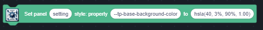
After running the block, the background for my whole GUI is now white! How neat!